Crash Course on Color in Lighting Design
.jpg)
.jpg)
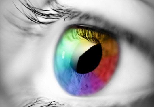
Lighting is electricity made visible, and color is not only considered one of the basic properties of light, but also the first noticed by an audience. Understanding color theory in lighting design is an art form all on its own, but it is also an invaluable tool for a lighting designer at any stage of their career. The best lighting designers must have an understanding and appreciation of the concepts, perceptions, and physical elements of the medium and how those relate to the sense of sight.

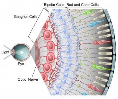
To support the perception of color, the human eye contains two specialized nerve cells in the retina called rods and cones. The rods perceive light and dark values, while the cones split into three groups of receptors that each perceive a different color; red, green, and blue wavelengths of light.


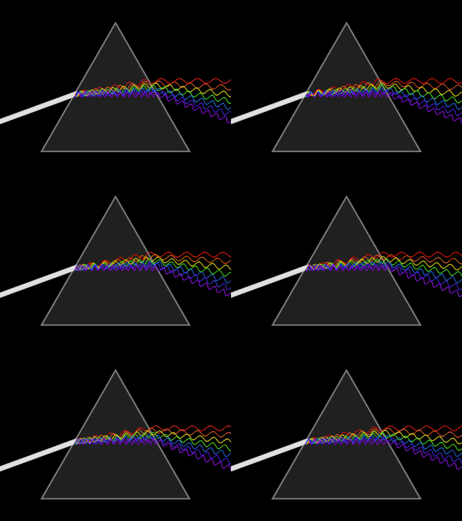
It is important to understand that all light is colored. White light is the combination of all the visible wavelengths of light mixed together. Light is one form of radiant energy. When white light is shined into a prism, it is easier to see the different wavelengths of light. Color media allows the lighting designer to access the full color range of the visible light rainbow.

Before there were color changing lights, you could change the color of light by putting a colored filter in front of the lighting source; referred to in the industry as a gel. Fun fact: the term gel originated because the first color filters were made out of gelatin and synthetic dyes! Today, the term gel is still used, but now they're made out of high-tech plastics; primarily either mylar or polyester.
Even with modern day advancements in plastics, over time and depending on the amount of use, gels begin to fade, warp, and even melt due to the fact that they absorb a lot of heat from filtering out certain frequencies. Darker colors, especially dark blues, absorb more frequencies because they are filtering out more light and thus are shorter lived.
The next biggest advancement in filters came in the form of Dichroic filters. Rather than absorbing the wavelengths of undesired color, dichroic filters reflect the unwanted color. In order to produce a particular color, these filters remove its complementary color. The resulting light output is greater than the output from traditional filters. Due to the fact that these filters are made by depositing microscopically thin films onto glass, they are extremely heat-resistant, and color fade is practically non-existent. The disadvantage of this technology is that Dichroic filters are extremely expensive to produce and very fragile.
Depending on the equipment available, the use of gels in lighting fixtures is becoming less common as color changing lights become more affordable and more common.
Two systems are currently at play: CMY(Cyan, Magenta, and Yellow) color mixing (subtractive color mixing), and LED (light-emitting diode) based fixtures; typically Red, Green, Blue, and sometimes amber and/or lime to mix together more of the visible light spectrum (additive color mixing).

Since color is the first quality of light noticed, it is important to remember that people react to color. Sometimes the response to color is both subtle and subconscious, and other times it is overtly physical. Whichever color is comforting to one could be found offensive by another. The meanings of color are always changing and often influenced by cultural background, personality, adjoining colors, and individual mood. Each person’s reaction to color can be unique. The mix of these influences can make sticking to a rigid set of rules regarding which colors to use difficult.
The following color meaning definitions are simply seen as a common interpretation and should be thought of as a “starter guide” rather than hard set rules to follow.
Sometimes it is logical and appropriate to break free from the normal conventions if doing so will support the visualization of the production's message.
All perceived color is transmitted to the eye by light. Color in lighting is rarely seen in isolation and is often seen as subjective. The use of color in any production should be to enhance its message or emotion. Always remember that color perception is based on comparison. Color chosen by the lighting designer can be emotional, symbolic, or iconographic to heighten the message being delivered to the audience by the action on the stage. Never forget that the primary objective of a lighting designer is illumination and that the object of illumination, is people! Go forth and have fun with color!