Can Comic Sans look good?
A design debate that has spanned decades.
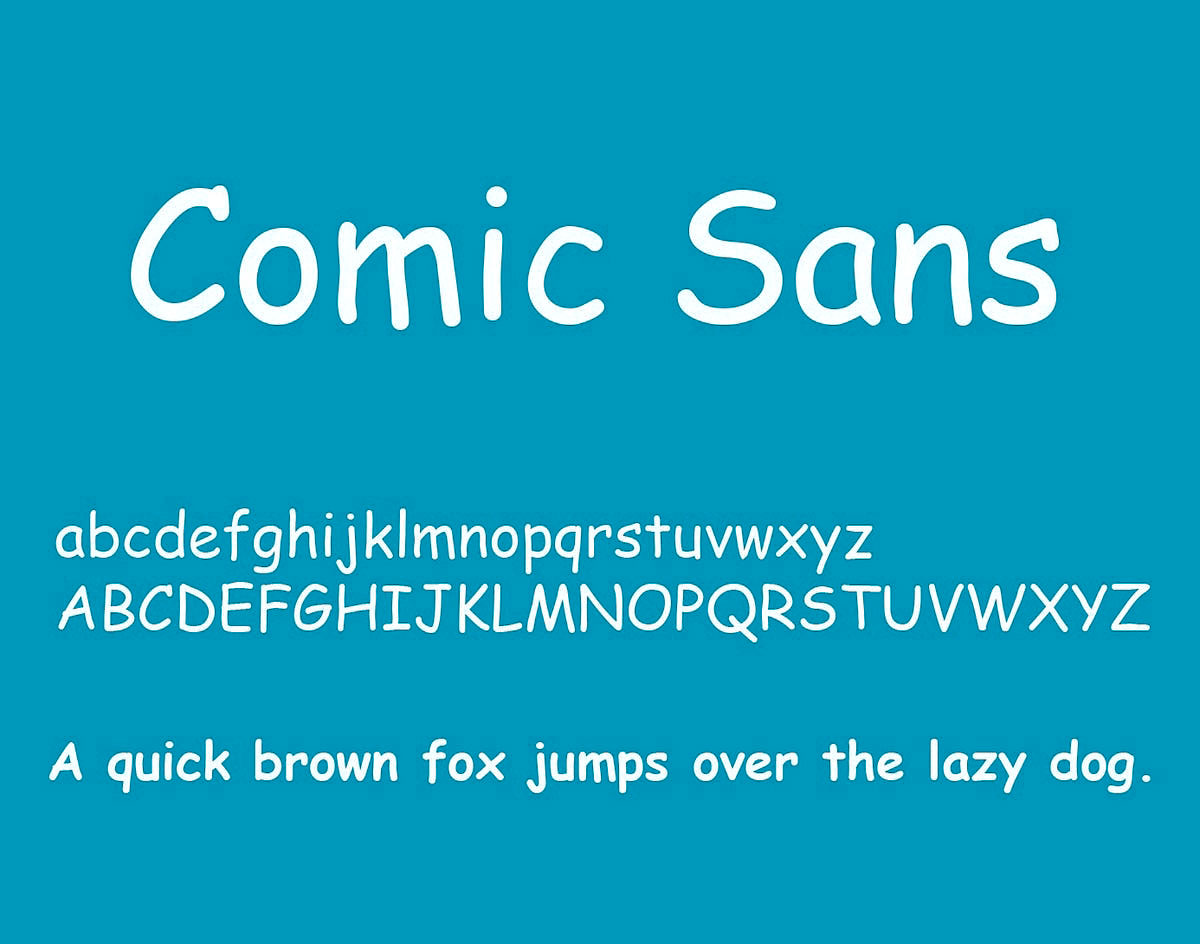
For many years Comic Sans has been at the centre of hot debate in the design work. Arguments in favour speak to its accessibility and ease of reading for dyslexia, whilst arguments against feel its overuse and childlike nature make it inappropriate for professional use.
What do you think?
Learn more on Wikipedia