A button is a design element that allows users to take action and help them complete various actions.
It is really important that the design of a button clearly conveys its function so the user understands what will happen if they select it.
UX buttons are usually styled links to attract users and drive them in a specific direction. Through buttons, we can
link to other pages or finish tasks like a form submission or buying online. Sometimes we use them as CTA (Calls to
Actions) when we need our users to finish their actions on our website.
Button Elements
Text Labels:
describes the button function in words and typically the text is a verb or short phrase
Icon:
is a glyph that symbolizes the button's function. Buttons can include icons and text, or an icon by itself
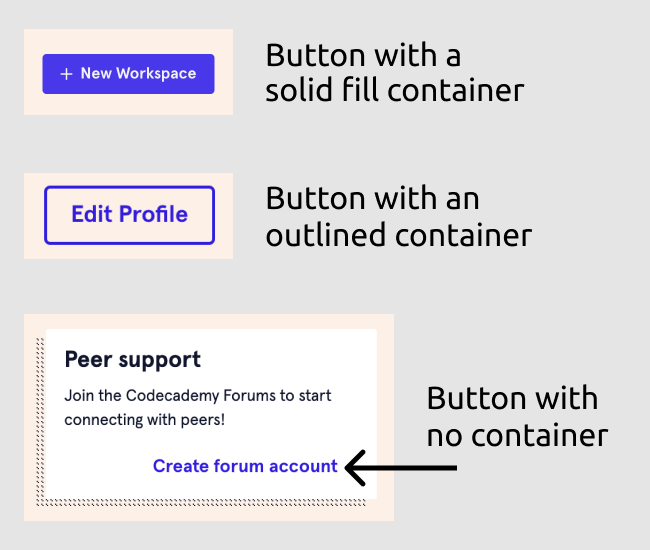
Containers:
is a shape that encapsulates the button's text label, action, or both.
- Buttons with containers: these create visual emphasis that allows the button to stand out form the other elements around it. Buttons with containers can appear with a solid fill or an outline but typically the ones with a solid fill can be found easier than the ones with just an outline.
- Buttons without containers: these buttons have less visual emphasis. Buttons without containers are commonly related to appear as links or lead you to a specific area of a page.
Button Hieriarchy
Buttons are usually categorized as primary, secondary and tertiary. These categories are correlated to be able to identify the most inmportant actions from the less important ones. This dictates the level of visual emphasis each button should represent.
Primary:
the primary action is what users are most likely to select. These buttons typically have a container with a solid fill and are designed to attract the user's attention.
Secondary:
Secondary buttons offer an alternative to the primary action, so these are given les visual emphasis than the primary buttons. These buttons are usually seen with an outlined container with no fill, or sometimes, no container at all.
Tertiary:
tertiary actions are additional actions that the user may need access. These have the least visual emphasis and are often smaller than primary and secondary buttons.
Button State
Button states let the user know whether they can click or have clicked a button. These elements also have overlapping states. For example, it could be "active" and "hover" at the same time.
Active and disabled state:
Active state is when the button is "clickable" or "tapable". It's important to know that sometimes a button can be disabled if the user hasn't completed the necessary steps.
Hover and hover off:
This state is mostly featured on desktop devices to let the user know the button is "clickable". Hover on and off also encourages users to click a button if they see an animation.
Pressed:
this is when the user's cursor or finger is "holding down" the button.
Clicked:
it is necessary to create a "clicked" state to indicate to the user the button has been clicked or interacted with.
Button Styling and Coloring:
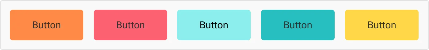
Color:
When designing is important to take into consideration users with color impairments. And to ensure that the color palette we're using when designing is accessible for everyone, we can use an online contrast checker.
It's also important to think about the color psychology when designing and the messages that these colors might convey.
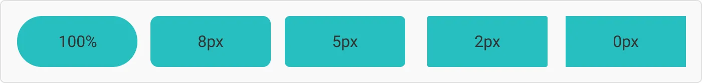
Border radius:
It's important that the border radius follows the branding and the aesthetic of the design. Sharp edge buttons look por serious while rounder radius look more fun.
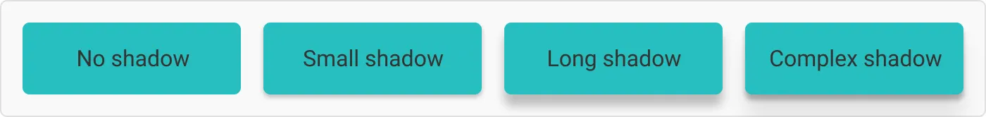
Shadow:
The shadow on a button makes the button feel like it is sitting off the page and naturally brings attention to it.
Shadows can also be used to indicate different states as well.
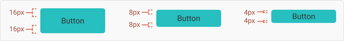
Vertical and horizontal padding:
The sizing of your button plays a big role in the accessibility of your interface.
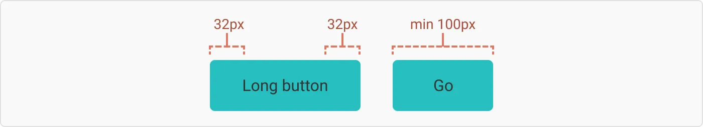
In vertical padding you should always take the line hight of the font you are using and add a unit to it. And with horizontal padding you can use two different approaches.
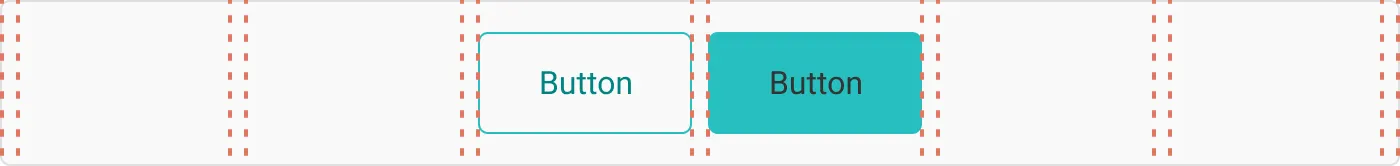
The first one is by making the button width align to the grid. This is a nice way of keeping all your buttons a consistent length.
With the second option you can have fixed padding on the sides. You can add a clause for a minimum width of a button, to avoid really small buttons.